Hello there,
I am super proud to show off our brand new website. We’ve been toiling away on it for ages in the background, but now it is all in the open for the world to see. This is just the beginning for Tutti - we are working on bringing some extremely useful services and tools specifically designed for artists, to help you find and book amazing, inspiring spaces.
The new website is https://app.tutti.space. There’s a lot of improvements I’m excited to show off, and a few features we had to remove due to technical limitations, that it’d be good for you to be aware of. So without further ado, here are a list of changes:
Improvements
Search page:
- Main search page now features a grid and map simultaneously:
- Side by side on Desktop
- Separate with a simple toggle between them on Mobile
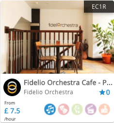
- Our focus has always been the creative industries, but before now our search page didn’t make that extremely clear. We’ve created a new system, with 5 different icons & colours that indicate the creative disciplines we are tailoring our services to now:
![]()
- (We’re aware that right now our search page doesn’t inform users what the little icons are - that is changing soon.) These new designs will be at the core of our website moving forward.
- Location of the spaces:
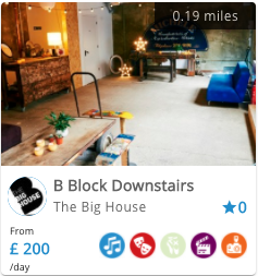
- As a visitor you will see the general area, by postcode, that the space is in (see the image below to the left)
- When you log in, that postcode will change to an exact distance, measure in miles, in relation to your home location that you entered upon sign up. If you didn’t set that correctly, you can change that in account settings --> private info.
- If you enter a place into the location search (and are logged in), the listings will show how far they are from that entered location.


Listing page:
- We’ve made the photos much more prominent - hosts can highlight up to 5 photos and then add others that can be seen if you click one of the first 5 and use your arrow keys to navigate through.
- Following the layout of many sites before us, we have lots of information about the space on the left, details if you scroll down, and booking box on the right.
Booking (for artists):
- You can batch book spaces now, booking multiple days at once.
- To request to book a space, you start by selecting a day
- Then you can simply select the start and end times.
- OR you can click “book multiple days” and tell us for how many days you want the space for.
- IF you want to get really specific, you can select different times on each of those different days, but by default the times you set on day 1 will be copied to all available days
- You do not have to enter your payment details in order to send a request now.
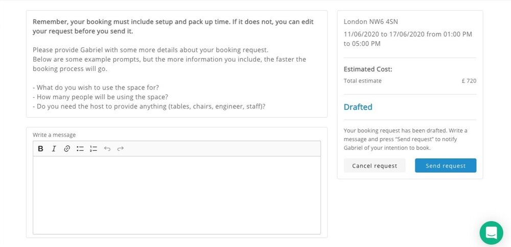
- In order to send a request, you have to write a message to your host about what you need the space for.
- Our system will estimate the cost based on the hours you choose, but feel free to negotiate with your host and find a price that works for both of you.
- A consistent issue with our past site was that it was not clear whether a booking was confirmed or not. We’ve attempted to fix that with clear booking statuses (large coloured text in the details on the right), and additional information about what each status means below that.
- A good thing to remember is that a booking is only confirmed when a host has accepted your request and you have successfully paid

Booking (for hosts):
- There is no longer a 3 day limit on accepting or rejecting bookings, as that led to too many missed opportunities. However, please continue to be as fast to respond as possible - the more responsive you are, the more likely our search algorithm will promote your spaces.
- You can now edit the cost of booking requests after they’ve come in, so if a user asks for a reduction in price for booking a block time, or you have different pricing for the time the user has asked for, but can’t accurately portray that in your listing prices, you can still accept bookings very simply through our system.
- The status of each booking request should be much clearer (Requested vs confirmed vs paid). But if you have any questions, don’t hesitate to message us using the green bubble at the bottom right of your screen.
- Bookings will only be confirmed now when the artist has successfully paid.
Temporary restrictions:
- For now, only one email address can be used to log into an account. You can add other email addresses to your account, but they will simply be able to receive notifications, and not log in:
- When you receive a booking request
- Details of an upcoming booking
- (This is marked as a temporary restriction as we plan on creating multiple user account access in the near future. We’re just not sure when.)
No longer available
Things we’ve had to remove for the time being:
- PayPal
- You can no longer accept bookings, or make payments using PayPal. We had to remove this feature due to technical limitations, and while we would like to re-implement it at some point, we do not know when that will be. Sorry for the inconvenience for now.
- View spaces in list form
- On the previous website, there were 3 options to display listings: Grid, list, and map. With this new site, we have combined grid & map, but have had to remove the list view. We have no plans to re-introduce this feature, however, if we receive enough requests for it, we will happily bring it back.
Existing bugs that we are working on and will be fixed over the coming 2-3 months (I am writing this in June 2020)
As with any new website, there will be little bugs and issues. Some of these we know about - here are the major ones that we’re actively working on fixes for:
- Keyword search only looks at text in the listing title, not the host info or listing description.
- Links from the previous website result in an error on the new site. While we won’t be able to fix this entirely, we will improve the error page you land on.
- The experience on mobile is frustrating - we’re aware and working on this. We’ll have the mobile experience cleaned up soon.
- Every listing has 0 reviews and a rating of 0 stars. Reviews from the old site didn’t get transferred properly. We have to input them manually...
- If you’re new to the site and haven’t read these patch notes, it’s not obvious what these little colourful icons mean. We’ll make this much clearer in our next sprint.
But as we’re a small team, there are undoubtedly small bugs that we haven’t coaxed out during our rounds of testing, and those will only show themselves when the site is out in the real world. If you do come across anything you think might be a bug, or something that doesn’t quite work how you’d expect it to, please take screenshots, videos, or simply write about it and send that information to bugs@tutti.space
Hope you’ve enjoyed this first set of patch notes - we are very excited to have this new site launched, and ready for iterations. We’ll make sure to update you as we iterate and improve our website.
Sincerely,
Gabriel & the Team @ Tutti

